
Webpage Analytics Portal
Designed for our operations team, this multi-functional page is a live dashboard meant to present lead metrics through intuitive charts and visualizations. Its purpose is to facilitate quick sharing of recruitment insights with clients.

Tools Used
Figma
My Role
Designer, Researcher
Team Members
Myself, Operations
Timeline
2 months
Purpose of this Project
Give our users more customization options for their Data
The operations team requires a dynamic solution to streamline their workflow and enhance communication with clients regarding lead metrics in recruitment and advertising. Currently, there is a lack of a centralized page that efficiently presents these metrics in an intuitive manner. Therefore, there’s a need for the development of a multi-functional live dashboard that offers comprehensive charts and visualizations, to help reveal recruitment insights to clients.

Objective
1 Create a tab that will work as a live data dashboard and can be updated by selecting desired templates.
2 Create functionality that will allow users to edit and create reports for live data.

User Demographic
Operations
Data Management and Analysis
The operations team relies on data to make informed decisions and optimize platform performance. They want access to data management tools, reporting dashboards, and analytics platforms to analyze user behavior, track key metrics, and gain actionable insights into platform usage and performance.
Real-Time Tracking
Carriers require real-time visibility into the location and status of their trucks and shipments. They want features such as GPS tracking, route optimization, and alerts for potential delays or disruptions to help them manage their fleets more effectively.

Platform Management Tools
The operations team requires robust tools and systems to manage various aspects of the platform, including user accounts, content management, data analytics, and system configurations. They want user-friendly interfaces, automation capabilities, and customization options to streamline platform management tasks.
Client
Continuous Improvement
The operations team is committed to driving continuous improvement and innovation within the platform. They want feedback mechanisms, feature request channels, and agile development processes to gather user input, prioritize enhancements, and iterate on the platform to meet evolving user needs.

Business Insights
Carriers require actionable insights and analytics to make informed business decisions and identify opportunities for improvement. They want access to performance metrics, trend analysis, and benchmarking data to track key performance indicators (KPIs) and drive operational efficiency.
Scalability and Flexibility
Carriers need a platform that can scale with their business and adapt to changing market dynamics. They want flexible pricing models, customizable features, and scalability options to accommodate their evolving needs and growth objectives.
Stake Holder Interviews
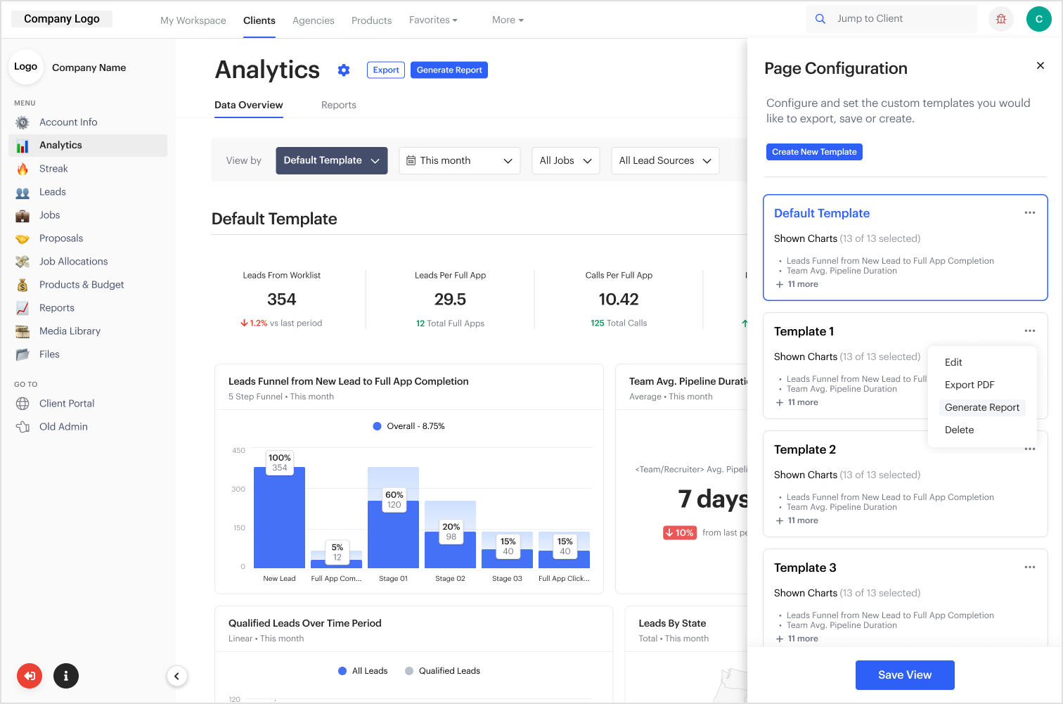
From the Analytics Page, the user will see the "Data Overview" tab first which will contain all the required functionality for the user to have a fully customizable experience with their reports.

Live Data Overview Tab
Objective
This new tab living in the new Analytics page would have to have several key features to help us present the most insightful data to the clients.
Solution
Since this design will act like a live dashboard that can be updated by selecting a desired template, there should be some sort of template configuration element. Then within that element, there should be key features: Create, Export, Delete, Edit, and Generate. These options cover all the ways to manage the data for client delivery.

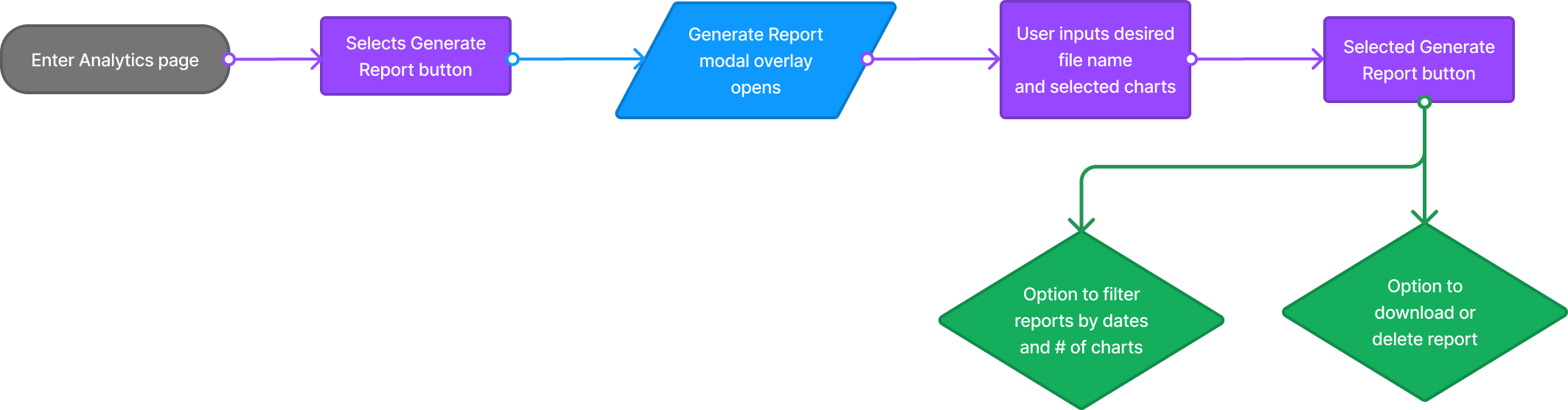
Flow Charts
Operations User Story
As a operations liaison to trucking carriers, I want to help visualize their leads and advertising data in graphic chart forms within the platform, enabling me to gain insights into the effectiveness of our client marketing efforts and make informed decisions to optimize their business strategies.

Low-Fidelity
Profile Entry Points
When looking into creating brand-new functionality with this level of complexity, I had to break down the requirements section by section, focusing on the entry points first.
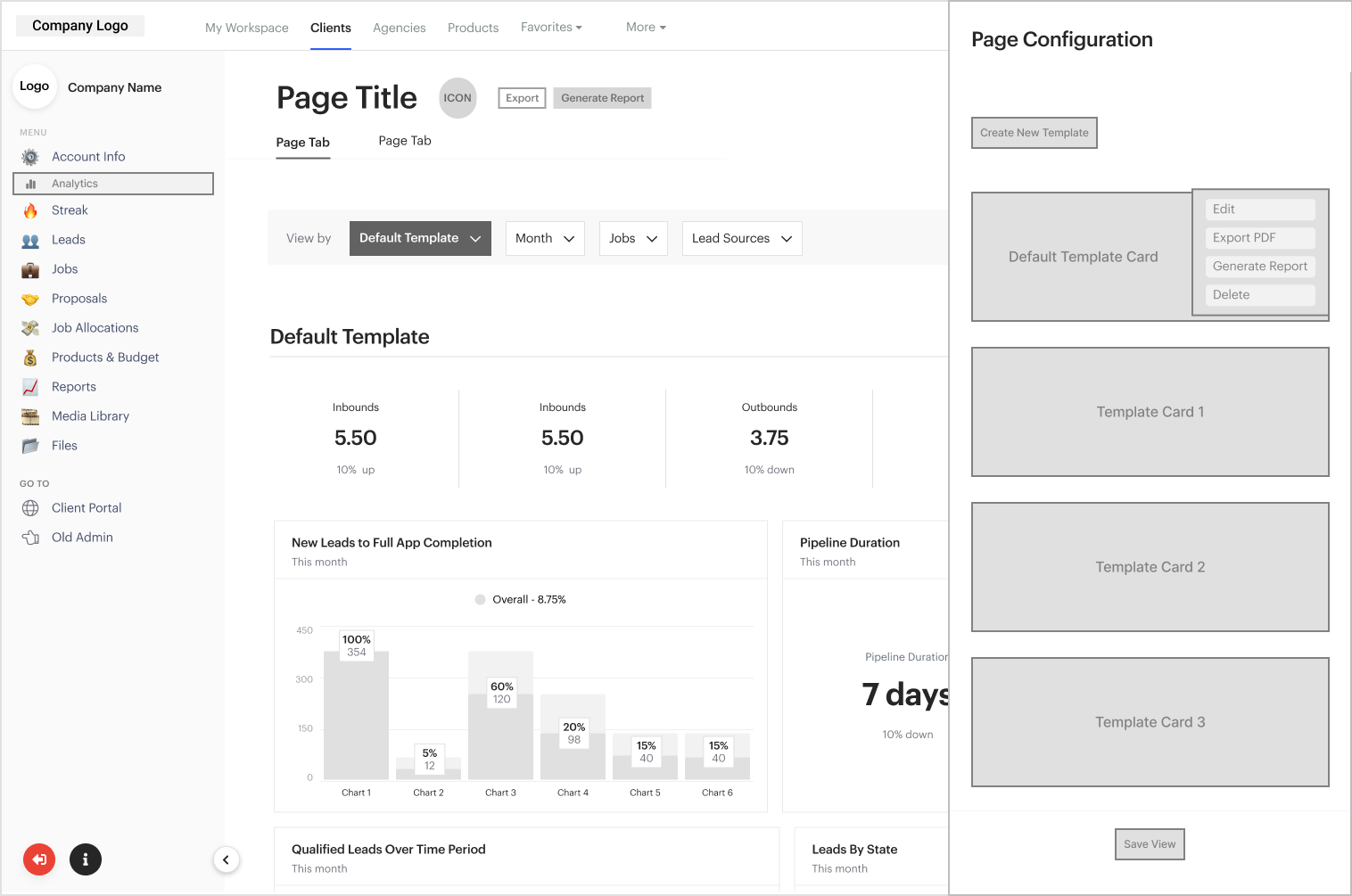
Side Panel Navigation Requirements
In this instance, I simply had to include the Analytics page in the main menu options and choose a suitable emoji to properly indicate data.

Header Requirements
In this newly designed header, the following functionalities were needed:
"Configure Page" gear icon which would allow the user to open a side-panel drawer to customize the template.
"Export" button so the user has the ability to easily export this specific template as a PDF.
"Generate Report" button so the user can generate this template into the reports page
"Data Overview" & "Reports" tab
Advanced Filtration element

Side-drawer Requirements
Side-drawer that allows the user to set the custom templates they would like to export, save, or create.
The Create New Template Button opens a full-screen drawer that allows users to create custom templates.
The Default Template Card allows users to always go back to a default state.
The Save View Button is in a disabled state until the user creates a new template.


Body Requirements
The body needed to include the live report components that would show off the data.

Create or Edit Template
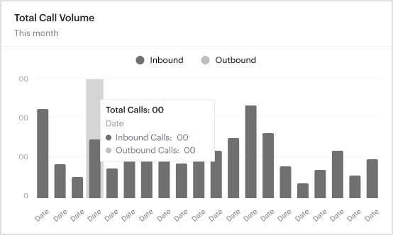
Template Graphics


High-Fidelity UI Design
Side Panel Navigation Requirements
Header Requirements
Body Requirements


Results
The Data Overview tab will be integral to the operations team who can now use this to generate charts and metrics to share them with our clients.

Side-drawer Requirements

Alignment and grid
For these projects, I always work in an 8-point grid for the project and set the margins within groups at 4, 8, and 16, with margins between groups at 24, 32, and 48.

Period-based Reports Tab
Overview
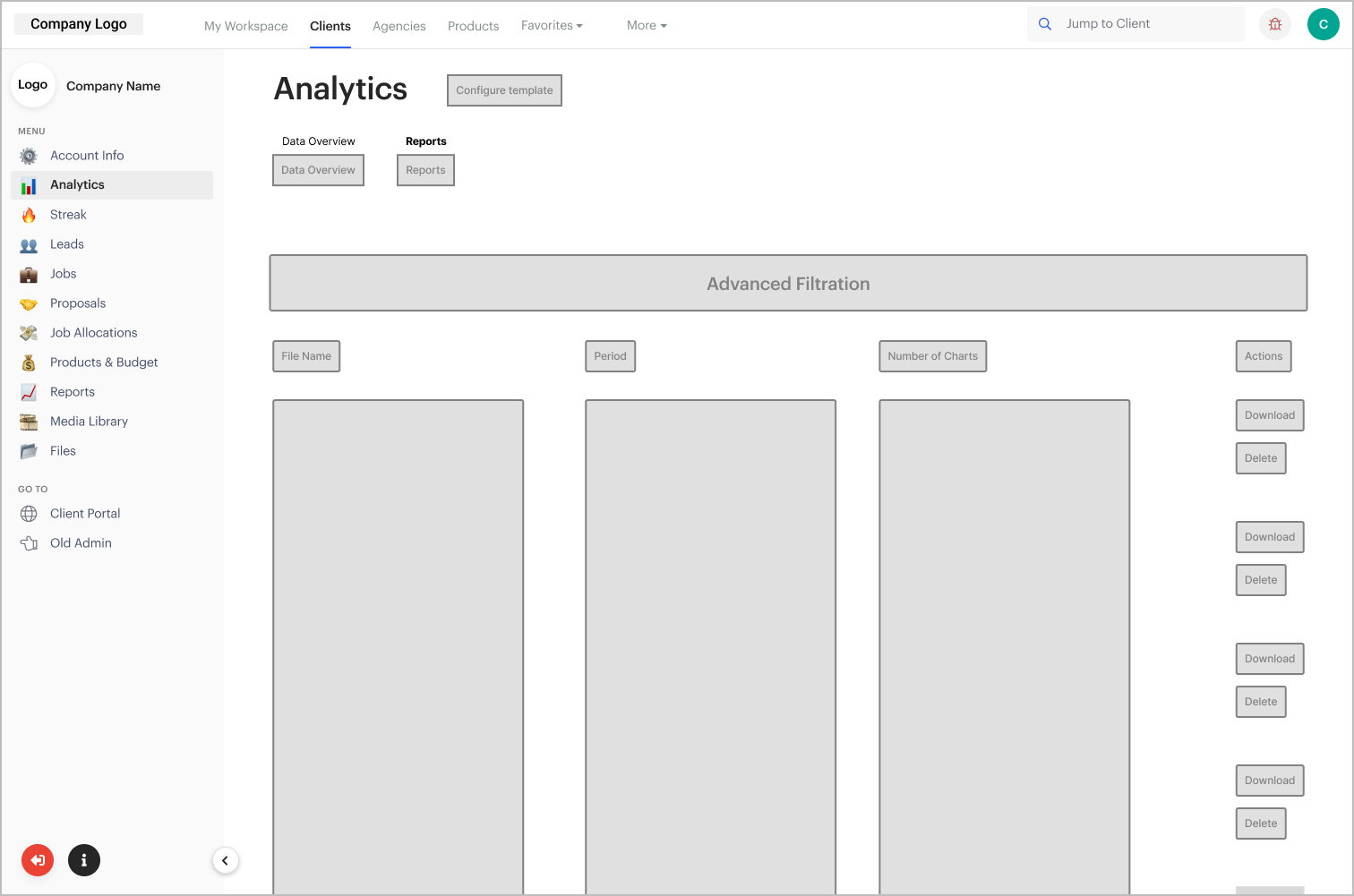
The new Reports tab will be a much more detailed historical breakdown of the reports on the different product lines that we use to help the clients acquire leads. They will able to download or delete, and have time-period-based filtration options.
Solution
A typical table should be used to house this information as well as support functionality.

Flow Diagrams
This new slider design attached to the bottom navigation bar leaves a sufficient amount of space as it doesn't take up much of the screen. Swipe up/down functionality lets the user expand the slider to reveal hashtags.
Low-Fidelity Designs
Generate Report Modal
This modal aims to allow users to select what charts to include or exclude in their generated report.

Empty State Reports Tab
If there are no reports created yet, this is the default state.
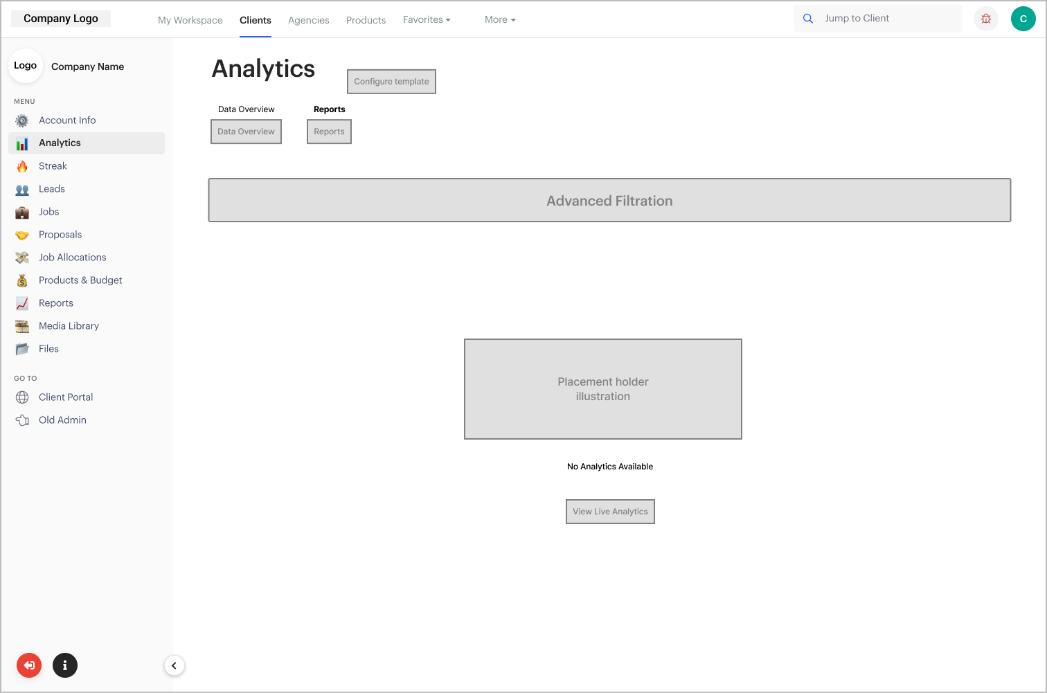
Reports Tab
The generated reports are populated in this table with comprehensive column information and filtration for the user to pick the specific reports they want to do an action with.
Delete Report Modal Pop-up
Typical modal pop-up about report deletion.

High-Fidelity Designs
Generate Report Modal

Reports Tab

Reports Tab (Empty State)
Delete Report Modal Pop-up

Alignment and grid
For these projects, I always work in an 8-point grid for the project and set the margins for within groups at 8 and 16, with margins between groups at 24, 32, and 48.

Final Designs
With the Reports tab, the user will easily be able to go back and forth between live data they're reviewing for the client and the reports they're creating for them to review.