Social Media App Updates
Updates for social media app that acts as a hub for truck drivers by fostering community support in the challenging trucking industry.

Tools Used
Figma
My Role
Designer, Researcher
Team Members
Myself, Engineering
Timeline
2 months
Purpose of this Project
Retain users by creating better community-based functionality:
User retention is a big challenge in the ever-changing world of social media. To stay successful, platforms must adapt to competition and evolving user expectations. Our goal to is tackle this challenge through increasing user satisfaction by adding new functionality to help encourage meaningful interactions, and build an attractive environment that keeps users coming back. By understanding user behaviors, preferences, and new trends, the designs aim to create a smooth and enjoyable user experience, leading to higher retention and ongoing platform growth.


1 Redesign the Services tab into the Home page so the supportive features of the app will become more visible and utilized.
2 Add functionality that will allow users to filter the posts they see on their Home page feed, customizing the user experience.
3 Create a fun, and interesting way for users to spend their app-specific currency to help increase user retention.

User Demographic
Truck drivers, like individuals in any other profession, have a diverse range of interests and preferences. However, there are some common themes and activities that often interest truck drivers.

Services Tab Re-Design
Objective
Reorganize the Services tab because it often went unnoticed and underutilized, primarily due to the extensive content buried within a cluttered menu structure.


Old Service Tab
Solution
Streamline our user experience by removing the services tab and strategically reorganizing its contents within the app. This adjustment aims to simplify the user journey, ensuring that essential information is easily accessible and prominently displayed.
New Service Dashboard
What’s needed

1 Trucking Jobs button to replace the “Services” tab.
With the high turnover rate in the trucking industry, we must support the users by having this option upfront.
2 Icons are already established in the design system. No need to replace them.
3 Button states: New, Default, Pressed
Default - the base state of the new buttons
New - Added tag to highlight a new service we’ve added
Pressed - to help show user-initiated tap
Competitive Analysis
I analyzed 3 popular apps that would inspire ideas for the services redesign - specifically the placement of the buttons/cards and how they present the information.
The good
All 3 apps utilize the feed space very well by placing additional feature options at the top. Among them, Facebook stands out as the most akin to our product, effectively utilizing the available space compared to the other designs for similar functions.
The bad
Instagram's design is most similar to the previous layout of buttons on the Services tab, but the limited space might not allow the buttons to stand out effectively. While Spotify's horizontal button is suitable for small images, our use of icons may result in excessive empty space.

High-Fidelity UI Design
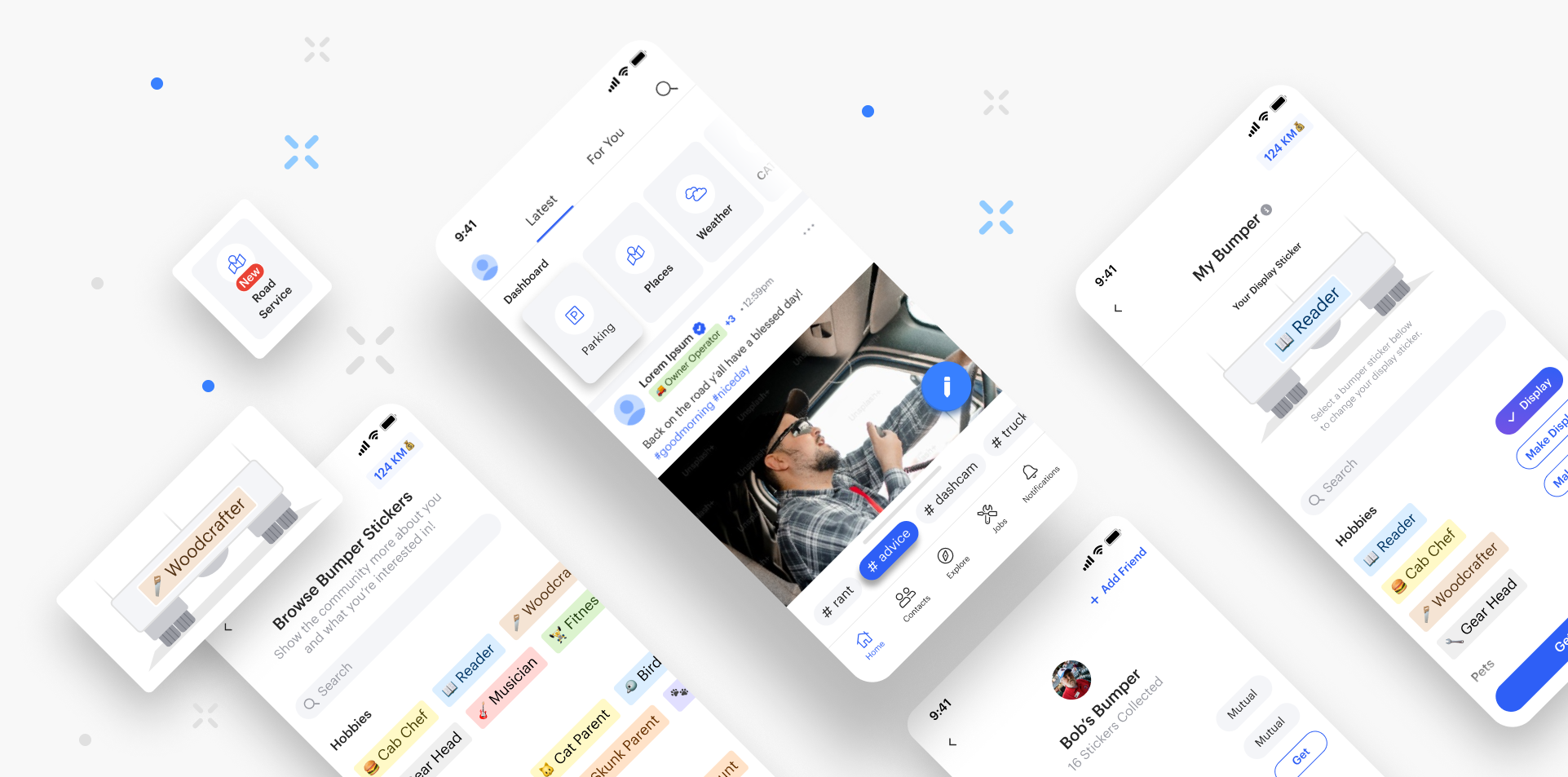
The "Dashboard" Container for services will have a carousel swiping functionality with tiles that scroll horizontally for more options. As the user scrolls, the container seamlessly minimizes and moves along with the feed, optimizing screen space during exploration.
The Services options will now be much more visible, as they'll be the first thing users see at the top of the screen, grabbing their immediate attention.
States: New, New Pressed, Default, Default Pressed

New Dashboard Element
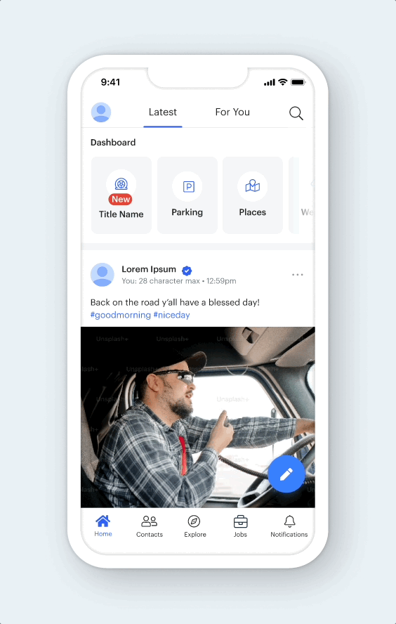

Final Design
Results
Increased app usage and created greater user retention.
1 Supportive features of the app are now up front for the user to use. This reduces another step in the process and creates a more all-in-one experience on the Home page.
2 Services menu is now organized neatly in a horizontal scrolling dashboard for the user to see.
3 User’s depend more on the CDLLife app for their daily wants and needs while out on the road, both socially and profressionally.

Sheet Hashtag Design
Objective
Create a design element that would organize the user's feed by hashtags. This will enable users to have more specific filtration for topics they're interested in. This not only fosters community connection but also enhances user retention by facilitating stronger bonds through shared interests. However, with the introduction of the new "Dashboard Slider" functionality, the available space on the Home screen has been significantly limited, leaving minimal room for additional design elements.
Solution
Create a compact design element that preserves screen visibility while incorporating additional functionality to expand when needed, optimizing space usage.

What’s needed…
A slider element that is small enough to fit in the space constraints would require additional functionality for a swipe-up gesture to open and view the rest of the hashtags. This intuitive gesture serves as a user-friendly mechanism, enabling a smooth transition between the visible hashtags and those hidden below.
Competitive Analysis
The good
The Amazon and Google Map apps have an interesting shortcut feature that allows users to quickly select the more popular options when browsing without changing screens. This could work for containing hashtag selectors because of how small and stackable they are.
The bad
The space is still small and needs to be able to hold enough filter options.

High Fidelity UI Design
This new slider design attached to the bottom navigation bar leaves a sufficient amount of space as it doesn't take up much of the screen. Swipe up/down functionality lets the user expand the slider to reveal hashtags.
Default, Selected Hashtag Button
Closed, Open, Expanded

Final Design

Results
Increased community strength and user retention.
1 Added functionality allows users to customize their Home page experience.
2 Greater community connectivity with shared interests that help form friendships.
3 Increased user retention and unique experience that separates us from the major social media apps.

Custom Visual Tag
Objective
Boost activity and the number of users on the app by creating a unique, and engaging way for users to spend the app's built-in currency that they have earned.
The built-in currency within this app is called "Karma Miles", and it was created to incentivize the users to engage with the app through a rewards-based system. However, there weren't many ways to spend these points so the idea was to create new functionality that would be interesting enough for users to want to spend their points on.
Solution
The idea is that users can spend their karma miles to acquire visual tags that they can add to their profile and next to their profile name within the feed for all to see. This also helps users find shared interests or commonalities with each other, thus building better relationships and increasing user retention. To stay in line with the theme of the app and the trucking industry, we opted to call these labels “Bumper Stickers”.

Competitive Analysis
Reddit has a feature called "User flair" which is a special tagging system that the user can choose to enable for their community that creates a visual flag next to the member's username.
Idea
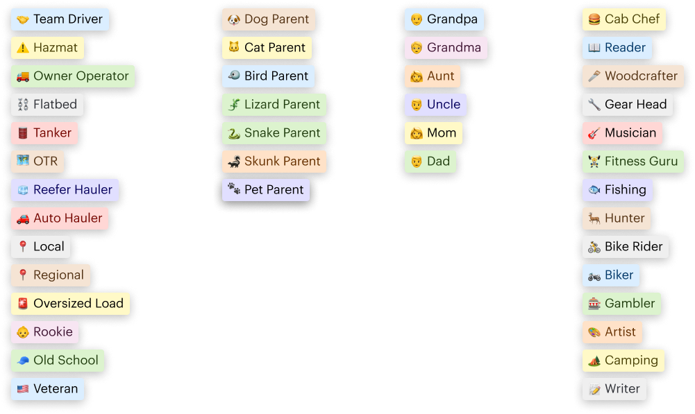
Create custom truck driver visual tags that the user can spend their currency on.
Examples →
🚚 Owner Operator
🇺🇸 Veteran
🪚 Woodcrafter

Flow diagrams
User Story 1
As a truck driver, I want to be able to browse and purchase a variety of bumper stickers that represent my interests and hobbies so that I can personalize my profile and showcase my identity within the truck driver community.

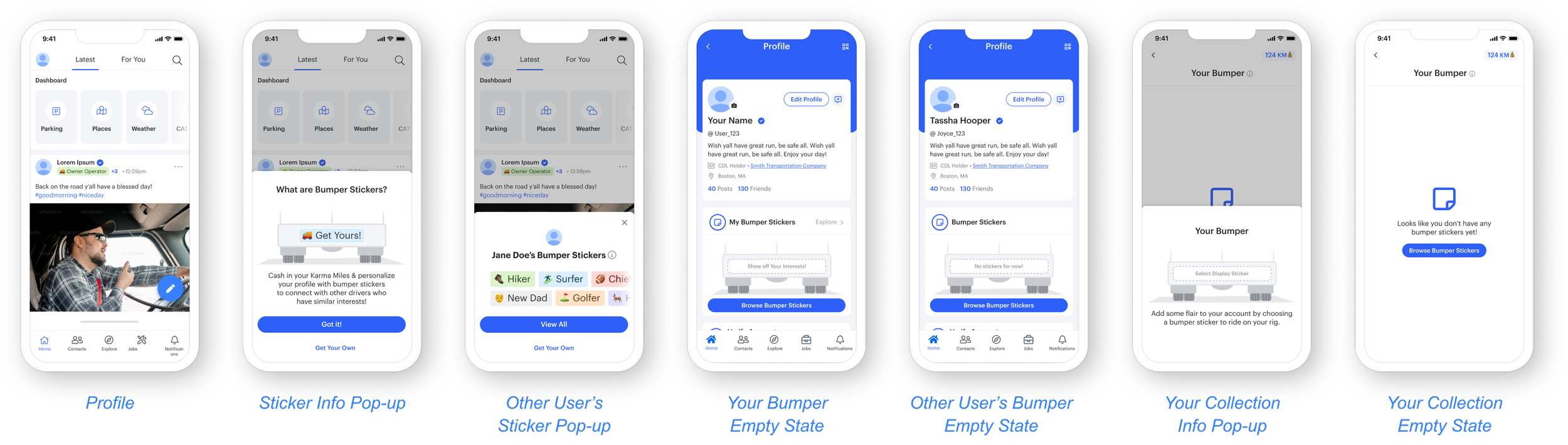
Empty States screens & Illustrations
Empty states provide a guide to users who are new to the platform. They offer a clean and uncluttered space with relevant information or prompts, helping users understand how to get started.
Pop-Up Modals
Confirmation or info pop-ups serve as a safeguard against unintentional or accidental actions. In a platform where users may be accessing the app while on the move or during breaks, preventing accidental clicks or submissions is crucial to maintaining a smooth user experience.
User Story 2
As a truck driver, I want the ability to find others with similar interests and connect with them because building meaningful connections on the app and on the road enhances my overall experience and brings value to the platform and my worklife

stickers in the home screen
When a user sets their bumper sticker, it will show in the home feed for all to see. From there, other users can have the option to see the first few or all they’ve collected, and also the option to browse stickers if they see any they want.
User to user relationships
Shared stickers will help show commonality between the users in hopes of the users interacting based on these interests. The hope is more driving with become connect through the app and ultimately on the road.
Low-Fidelity
Before diving into high-fidelity mockups, I prioritized creating low-fidelity designs to focus on the fundamental structure and functionality of the app. These initial sketches allowed me to explore different layout possibilities, user interactions, and navigation paths without getting bogged down in visual details.
User Story 1: Navigation and Information Architecture
By sketching out different navigation structures and screen hierarchies, I was able to identify the most intuitive way for users to discover, learn, and use the new sticker concept. This process involved mapping out the flow from the home screen, creating information pop-ups, and ultimately the checkout and display process.

User Story 2: Community Discovery
One of the primary objectives was to facilitate community building within the app. Users will be able to view other users’ stickers, so they can find similar interests based on their sticker collections and activity within the app. Creating layouts to improve connections and mutual interests helped inform the final design.

High-Fidelity UI Design
Why these colors?
Web Accessibility Testing
Prioritizing color contrast accessibility in product design is essential for creating inclusive, user-friendly experiences that comply with accessibility standards, expand market reach, enhance brand perception, reduce cognitive load, and ensure long-term sustainability.
Pass
WCAG AAA Compliance
Pass
WCAG AA Compliance


What will the bumper stickers look like?
After some ideation, the final design for the sticker should be subtle and easy on the eyes since it will populate in the feed next to everyone's posts. It should be rectangular like a real bumper sticker with pleasing colorization.
Sticker Design

Sticker options
Type of Driver
Pets
Family
Hobbies
Bumper Illustration
The design would be similar to the back of a truck where the bumper would be visible. Keeping it greyscale will ensure it doesn't compete with the color bumper stickers being added.
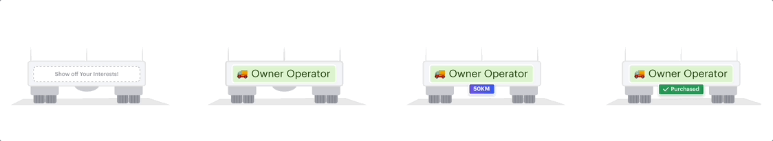
State: Empty State, Default, Purchase w/ Karma Miles, Confirmed Purshase
Home Feed Entry Point
User interaction for the first time with bumper stickers
Empty states for bumper sticker illustration and sticker collection

Explore other user’s collections
Stickers could be “Mutual” or not purchased yet so we give the user the option to buy it
Option to send friend requests or messages to help form better connections between users within the app.
A user wants to purchase a sticker
Info pop-up if first time visiting
Confirmation pop-ups and confetti animation to make completion more exciting
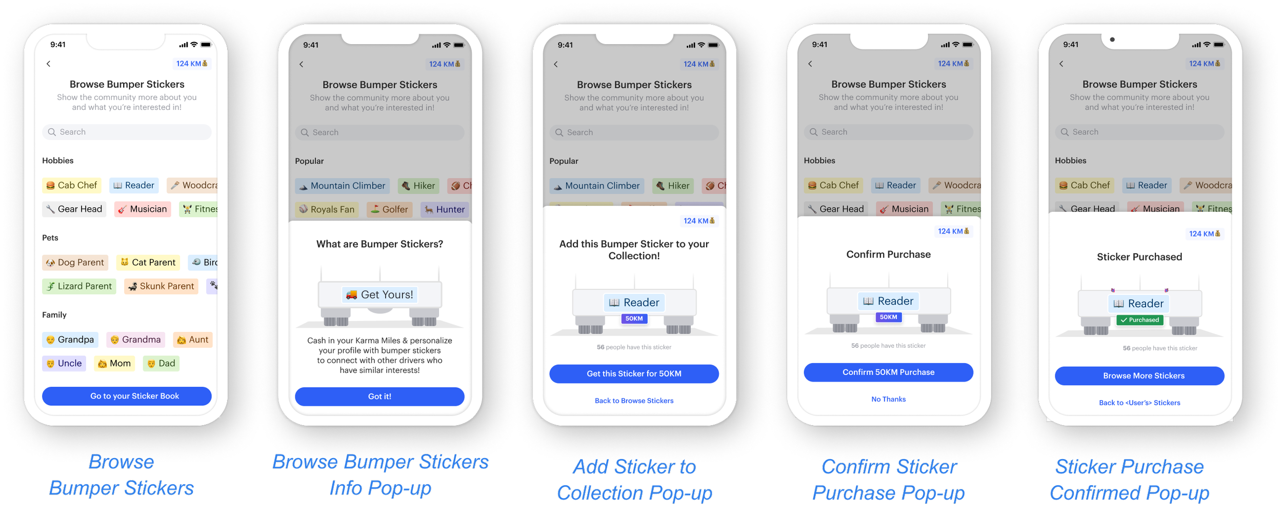
A user wants to make a sticker their display sticker
Info pop-up if first time visiting
Confirmation pop-up and updated bumper sticker illustration

Alignment and grid
For these projects, I always work in an 8-point grid for the project and set the margins for within groups at 8 and 16, with margins between groups at 24, 32, and 48.

Results
Gives purpose to collecting in-app currency and builds community connectivity.
1 Fun and customizable experience that brings color to the ordinary design.
2 Gives better purpose and gamifies the in-app currency for users to collect and spend.
3 Creates more opportunities for community connection and relationships.

